Enel Energia App Next project
CorporateUI DesignInteraction

Essilor Luxottica

Year 2023
Type Corporate
Role Lead Designer
Live site

A corporate identity built to represent the whole EssilorLuxottica group.

EssilorLuxottica formed in 2018 from the merger of Essilor, the lens manufacturing leader, and Luxottica, the leading frame designer and retailer.

Each brought its own history. Its own portfolio of brands.

The corporate site had to represent the group as a whole, not flatten it into something smaller.

EssilorLuxottica needed a digital presence strong enough to represent the scale of the merger. Strong enough, but not so strong it competed with, or diminished, the many recognisable brand names it now carries.

How does a corporate identity assert itself while leaving room for everything it holds underneath?
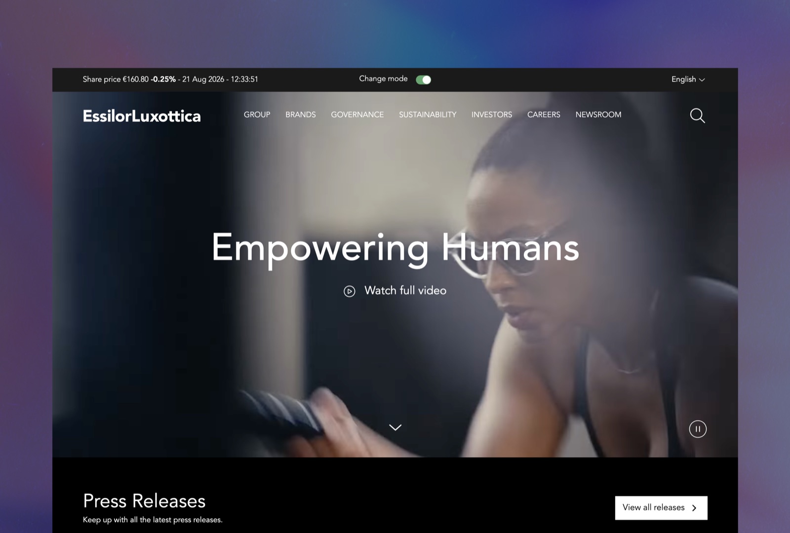
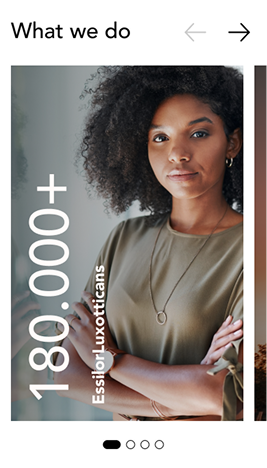
The redesigned corporate site: dark, cinematic, an iridescent brand system built specifically for the group
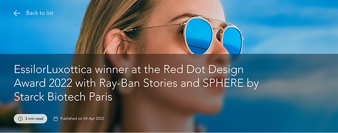
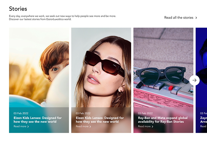
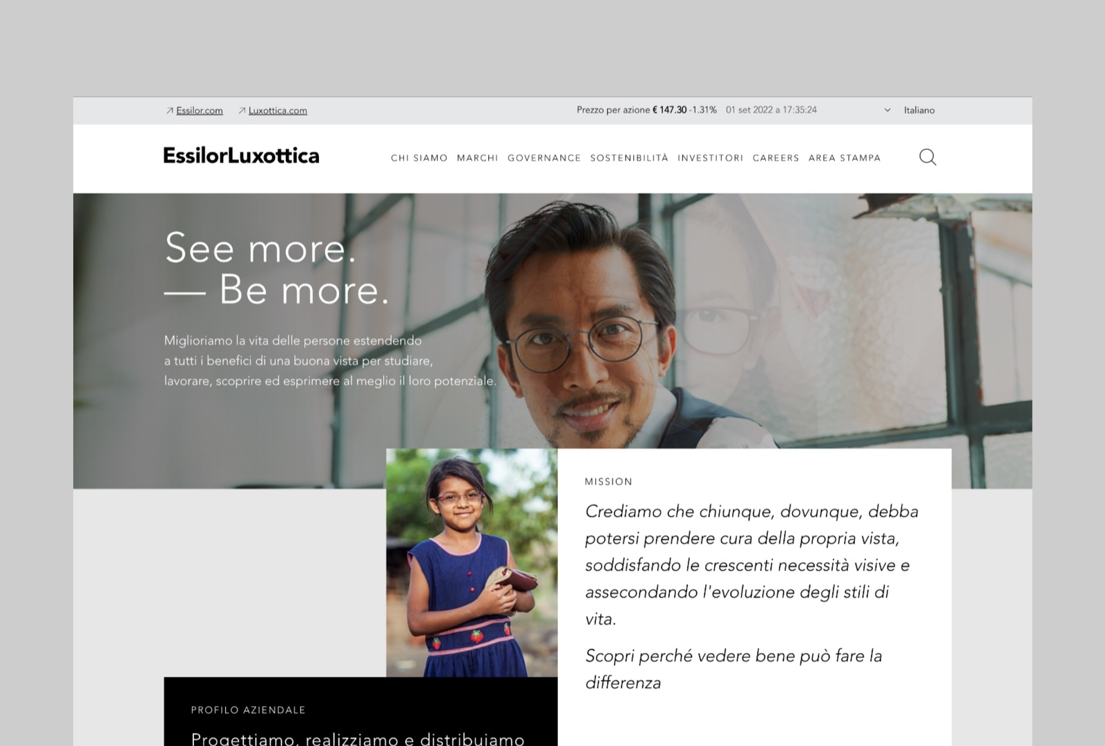
EssilorLuxottica's previous corporate site: light background, generic stock photography
BeforeAfter

Drag to compare the site before and after the redesign

From first choices to a system shared with the team.

I led the project first hand.

Concept, palette, visual language, hierarchy, interaction. All defined working closely with EssilorLuxottica's own UX team.

Once the guidelines were set, handing off to the internal team let the system grow well beyond the project's early phase.

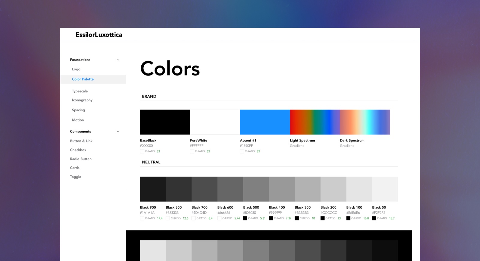
EssilorLuxottica design system documentation: the brand's colour palette, including the iridescent light and dark spectrum gradients

Light as the Group's Chromatic System

Most groups this size default to a single corporate colour. We went a different way.

The direction came from the physics of the product category itself. How light moves through a lens.

An iridescent system, restrained by a monochrome base, gave the brand a way to feel premium without competing for attention.

Dual circular iconography, echoing both eyes and lenses, became the connective thread across a portfolio that otherwise had very little visual overlap.

EssilorLuxottica design system component

Drag to explore the component library

A System Built to Share the Vision

The Colour Accent Comes From the Lens Itself
The brief called for a clean corporate palette, black and white. But a single colour wasn't enough to tell the story of a group born from lenses. I found the accent in how light refracts through optical glass. An iridescent system, used sparingly over a monochrome base. Restraint became the real design decision.
Motion That Behaves Like Light
I modelled the animations on light refraction. Present enough to register, subtle enough to stay in the background where they belong. The same principle guiding the rest of the system.

Aligning With an Already-Structured Team's Language Is, Often, the Real Design Work.

Joining an already complex team, with its UX choices and its way of working already defined, mostly required alignment. The most delicate part, working as an external designer, was finding common ground with EssilorLuxottica's own design team: making my proposals coincide with what they had already built on the UX side, so everything could arrive clean all the way to the handoff for development. Once I found that alignment, the rest came naturally.

Let's talk

Need this kind of thinking on your next project?

Omar Mootamri Usually replies within a day